예전에 플렉스 개구리에 대한 해답을 올려놓았었는데 (2020/05/12 - 플렉스 개구리 공략집( Flexbox Froggy Solutions ) flexbox에 대해서 익힐 수 있는 것이 다른 것을 발견하여, 공략집을 올립니다. UI가 비슷한 것이 플렉스 개구리의 후속 편이 아닐까 싶습니다.
http://www.flexboxdefense.com/
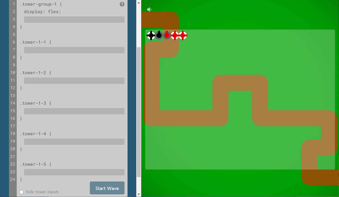
Flexbox Defense
Your job is to stop the incoming enemies from getting past your defenses. Unlike other tower defense games, you must position your towers using CSS!
www.flexboxdefense.com
몰려오는 적들을 물리치기 위한 방어타워를 적합한 장소에 배치하는 것이 목적이며, flexbox를 적절하게 활용하여야 모든 적을 물리칠 수 있습니다. 모두 12번의 침공을 막아내야 합니다. 문제와 합께 팝업으로 필요한 속성에 대해 설명해주기 때문에 난이도가 그리 높은 편은 아니니, 먼저 해보시고 잘 안되실 때, 아래의 해답을 참고해보시면 좋을 것 같습니다. 그리고 해답은 한 개가 아닐 수도 있습니다.
첫 번째 침공

.tower-group-1 {
  display: flex;
  justify-context: center;
}
두 번째 침공

.tower-group-1 {
  display: flex;
  justify-content: flex-end;
}
.tower-group-2 {
  display: flex;
  justify-content: center;
}
.tower-group-3 {
  display: flex;
  justify-content: flex-end;
}
세 번째 침공

.tower-group-1 {
  display: flex;
  justify-content: center;
}
.tower-group-2 {
  display: flex;
  justify-content: space-between;
}
네 번째 침공
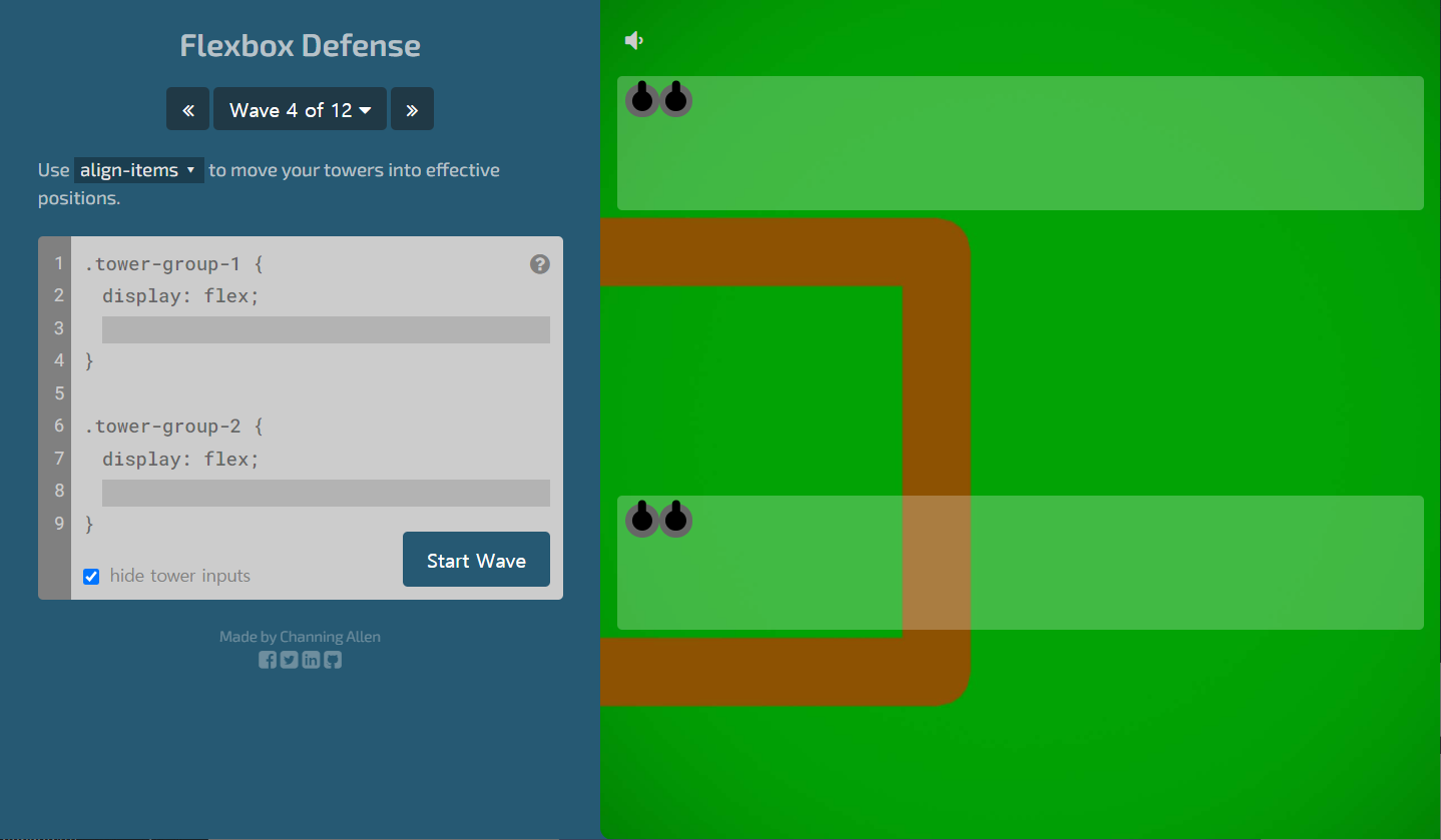
.tower-group-1 {
  display: flex;
  align-items:flex-end;
}
.tower-group-2 {
  display: flex;
  align-items:flex-end;
}
다섯 번째 침공
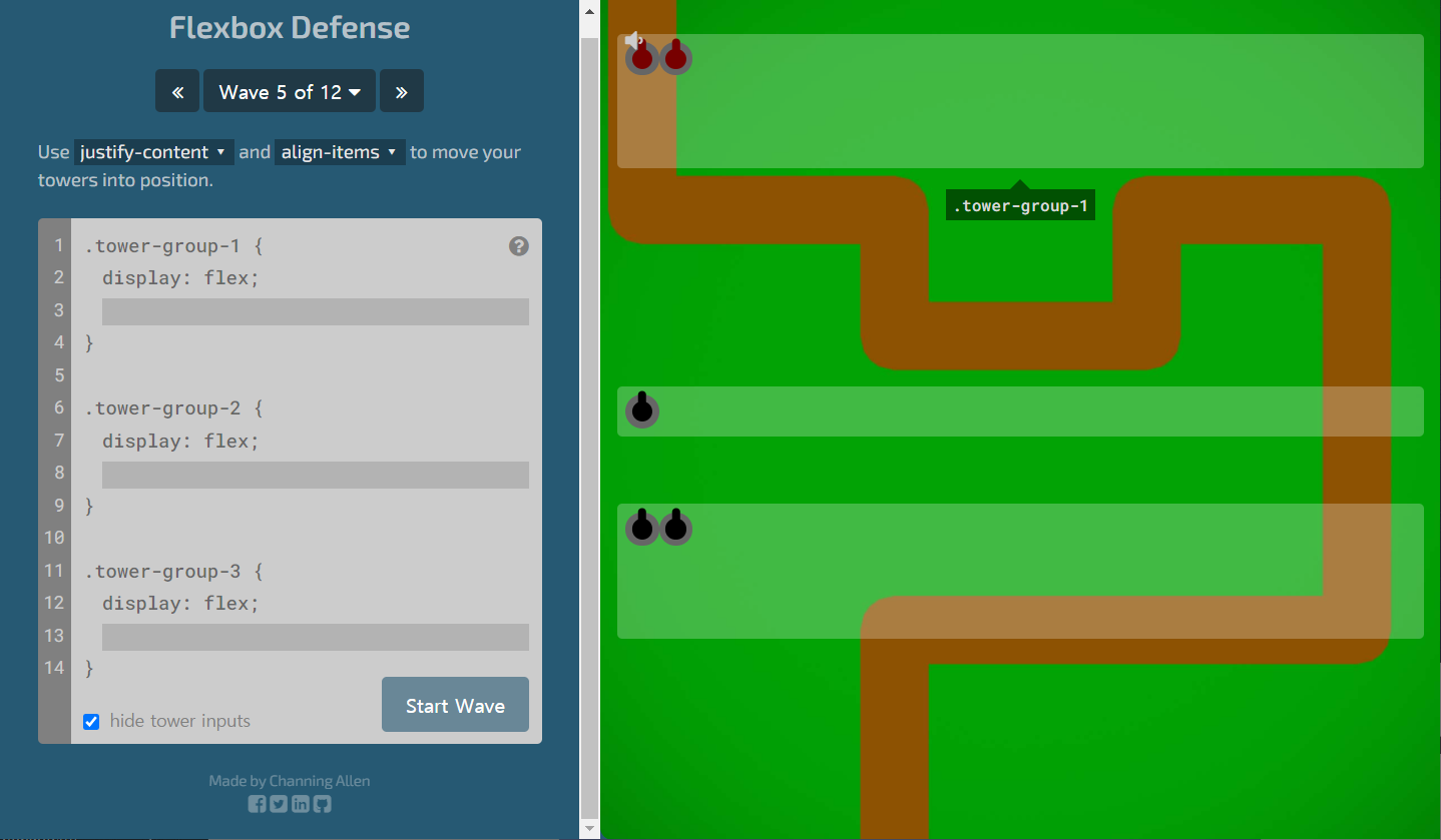
.tower-group-1 {
  display: flex;
  justify-content: space-around;
  align-items: flex-end;
}
.tower-group-2 {
  display: flex;
  justify-content: center;
}
.tower-group-3 {
  display: flex;
  justify-content: space-around;
  align-items: center;
}
여섯 번째 침공
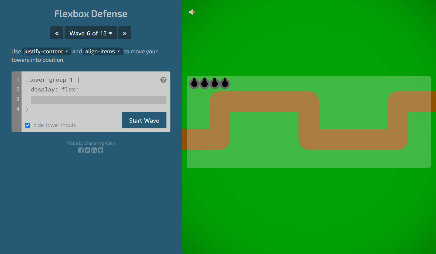
.tower-group-1 {
  display: flex;
  align-items: center;
  justify-content: space-between;
}
일곱 번째 침공
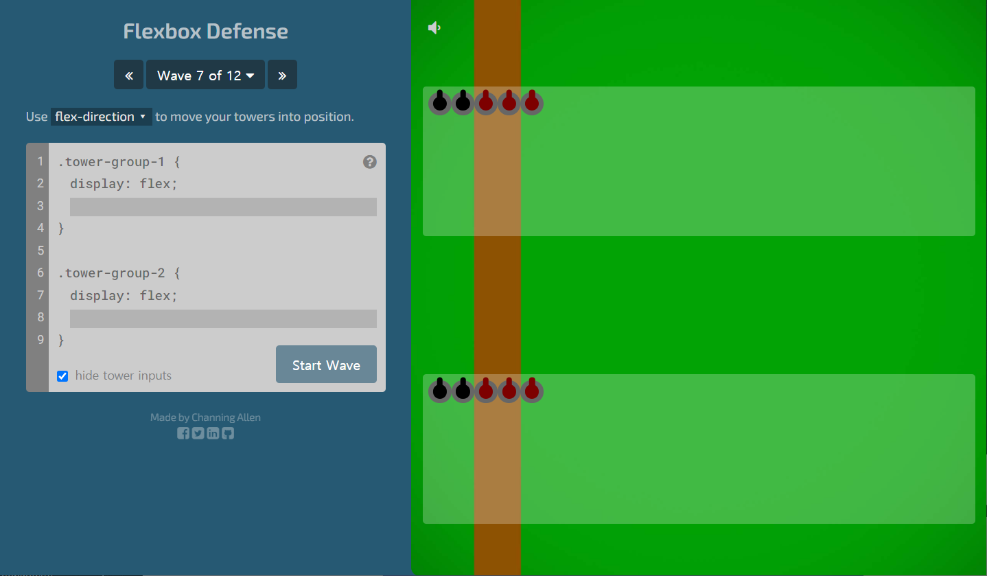
.tower-group-1 {
  display: flex;
  flex-direction: column;
}
.tower-group-2 {
  display: flex;
  flex-direction: column;
}
여덟 번째 침공
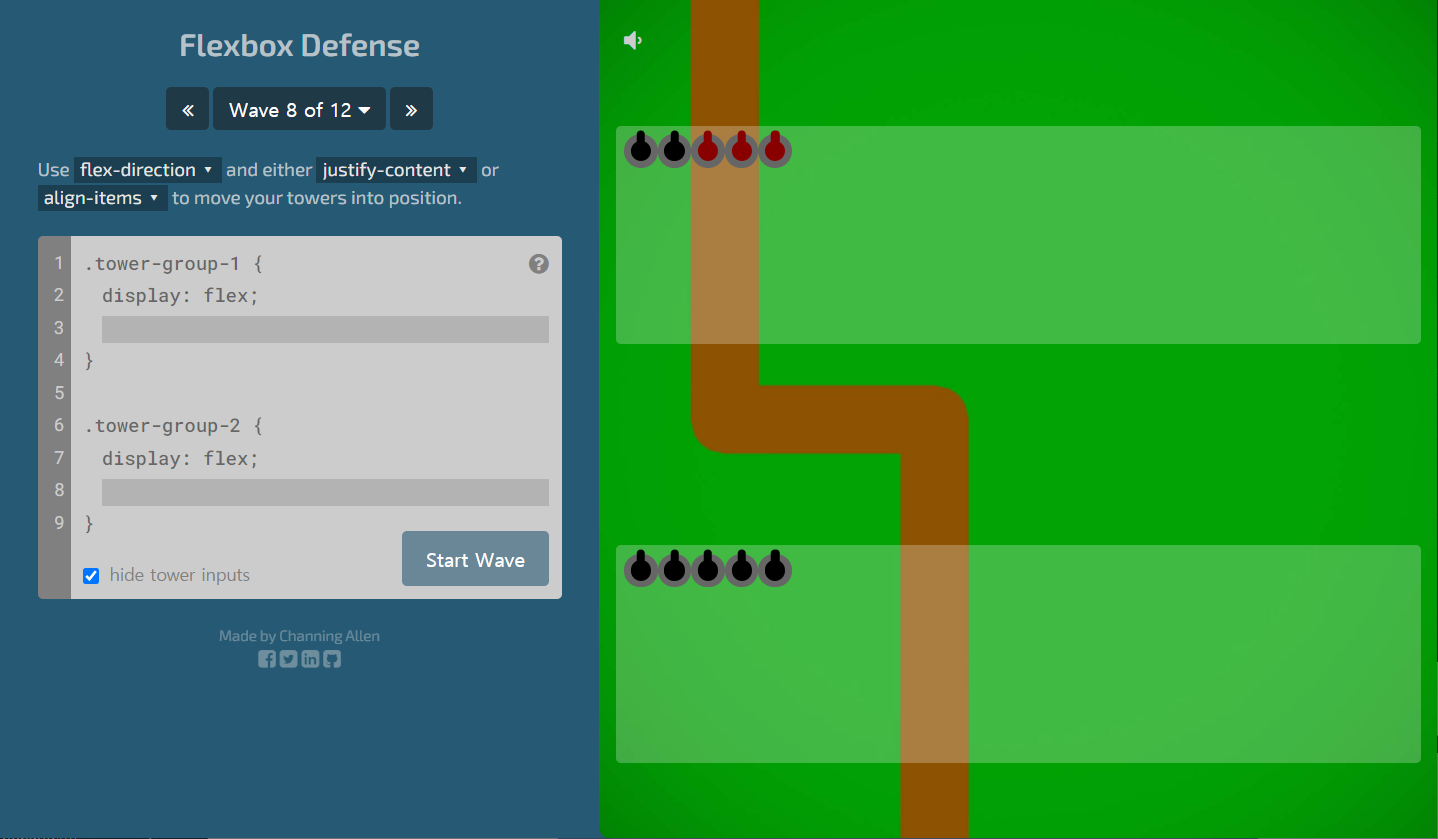
.tower-group-1 {
  display: flex;
  flex-direction: column;
}
.tower-group-2 {
  display: flex;
  flex-direction: column;
  align-items: center;
}
아홉 번째 침공
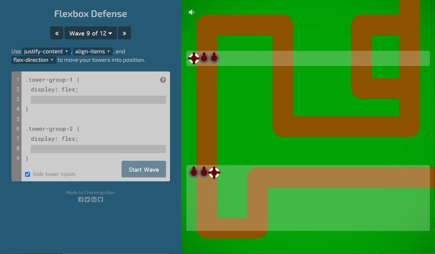
.tower-group-1 {
  display: flex;
  flex-direction: row-reverse;
  justify-content: space-around;
}
.tower-group-2 {
  display: flex;
  flex-direction: row-reverse;
  justify-content: space-around;
  align-items: center;
}
열 번째 침공
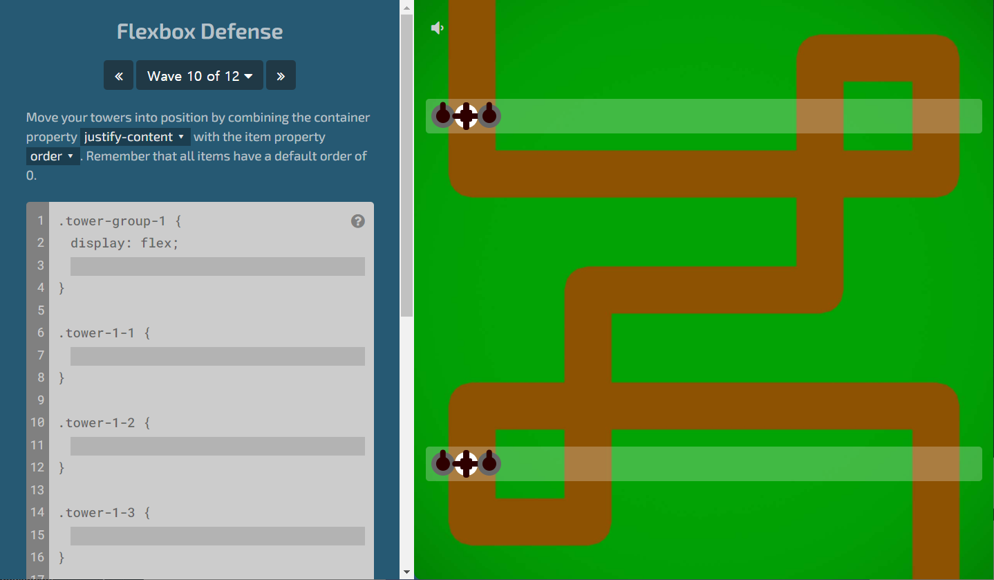
.tower-group-1 {
  display: flex;
  justify-content: space-around;
}
.tower-1-1 {
}
.tower-1-2 {
  order: 2;
}
.tower-1-3 {
}
.tower-group-2 {
  display: flex;
  justify-content: space-around;
}
.tower-2-1 {
  order: 1;
}
.tower-2-2 {
}
.tower-2-3 {
}
열한 번째 침공
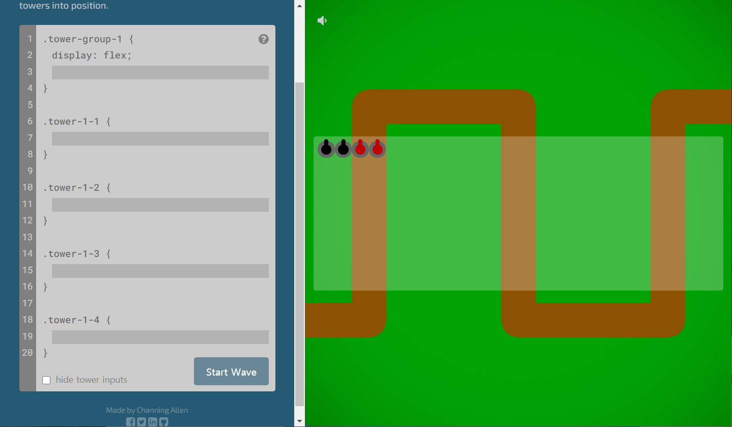
.tower-group-1 {
  display: flex;
  justify-content: space-between;
}
.tower-1-1 {
  align-self: flex-end;
}
.tower-1-2 {
}
.tower-1-3 {
  align-self: flex-end;
}
.tower-1-4 {
}
열두 번째 침공
.tower-group-1 {
  display: flex;
  justify-content: space-between;
  align-items: center;
}
.tower-1-1 {
  order: 1;
  align-self: flex-start;
}
.tower-1-2 {
 order: 2;
}
.tower-1-3 {
  order: 4;
  align-self: center;
}
.tower-1-4 {
  order: 3;
}
.tower-1-5 {
  order: 5;
  align-self: flex-end;
}

-끝-
반응형